The First Meeting
This project started out as a simple request from the clients. The family contacted Reico Kitchen & Bath for a quote to swap out the cabinets based on their existing layout. They had previously hired an interior designer to spruce up their kitchen, but weren't entirely satisfied with the outcome.
However, after learning more about the current situation and what they were hoping to accomplish it soon became clear that simply replacing cabinets wouldn't address all of the family's concerns. Reico Kitchen & Bath Frederick, MD designer Paula Truchon realized that bigger changes were needed.
The Challenges
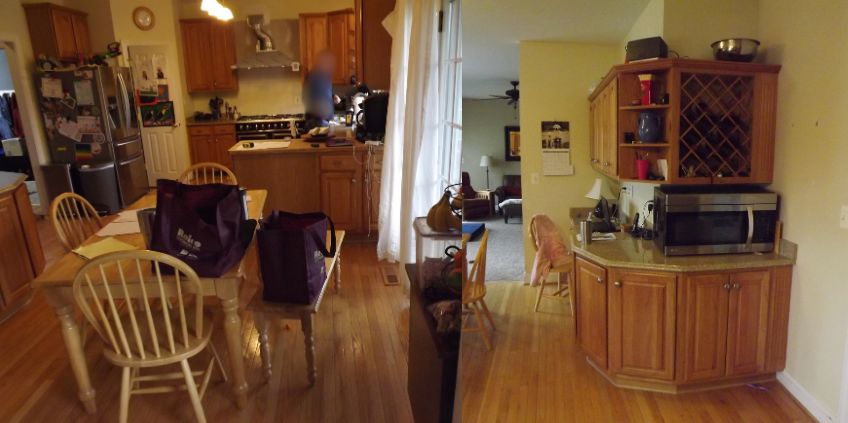
The refrigerator was designed and placed where it was convenient for new construction, but not for the family. It blocked pantry access and its exposed side made the kitchen look messy.
The cramped peninsula was too small for even two people and made the cooking prep area cramped for the family when more than one cook was involved.
The family also strongly disliked the ineffective design that wrapped cabinets around at the end. The space was inefficient and collected clutter instead of providing usable space.
More than anything else, the kitchen just couldn't accommodate everyone comfortably. With five or six people in the house, the kitchen always felt overcrowded, leading some to retreat to the living room rather than squeeze into the space.
The Ideas
Create more Space
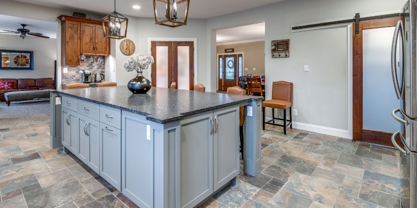
In the new kitchen design, the focus was to create more space. It started with reclaiming wasted space and creating a design and environment that the family enjoys. However, the most significant change came from Paula’s recommendation to extend the space by removing a wall that had a small hallway behind it. The removal of that wall and some non-load bearing dining room columns allowed the space to extend out an additional four feet from the original space, providing much-needed additional square footage.
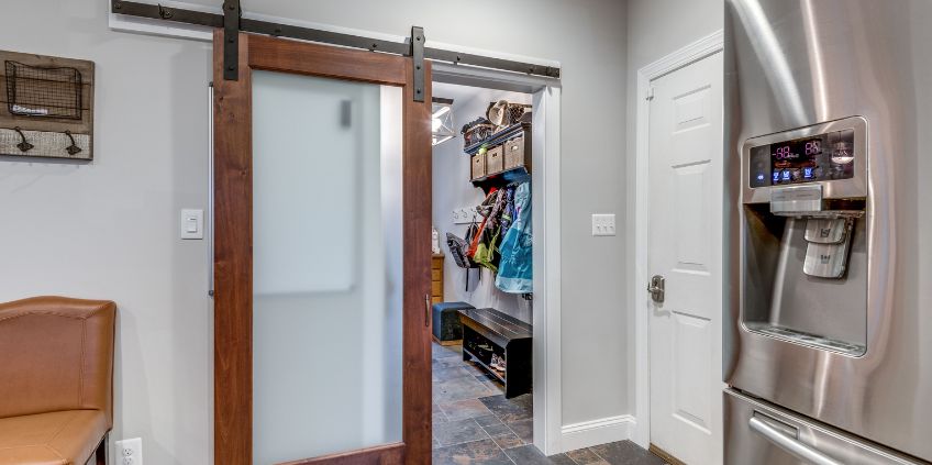
To optimize space efficiency even more, a sliding barn door was installed for easy access to the garage and laundry rooms. Open or closed, it takes up minimal room in the kitchen area.
A New Location for the Refrigerator
In the new design, the family refrigerator was moved to where the pantry used to be. This change eliminated the issue of the refrigerator access blocking the pantry entrance. The refrigerator now blends seamlessly into the design, improving access, functionality and aesthetics.
Customized Pantry and Beverage Center
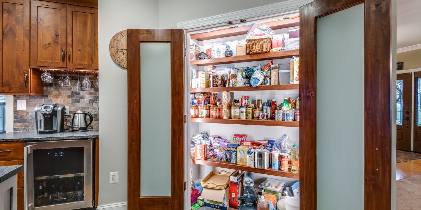
By extending the space and removing the wall of cabinets ending in the wraparound, Paula was able to add a new pantry with frosted double doors, interior lighting and doors finished to complement the new cabinet finishes. A beverage center was designed adjacent to the pantry, giving the space a clear purpose for use to access hot and cold beverages and related items in a well-organized space.
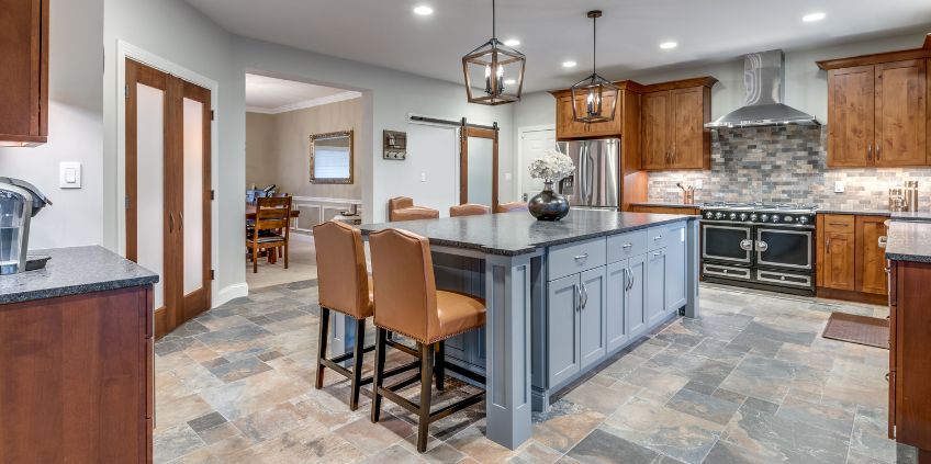
Multi-purpose, multi-person kitchen island
The kitchen island was created with gatherings in mind. The family chose not to include appliances on the island, making it more spacious for entertaining, with the ability to double as a serving area for family meals or when hosting larger groups. Larger walk ways also created easier movement around the island. The island legs are designed as posts and covered with an apron, creating a stylish furniture-like appearance that elevates the entire design.
Cabinetry Selection
Paula and the client worked together to find the perfect combination of cabinets and finish. While there were stock cabinet options available, they lacked the detailed furniture elements that complemented the room's new direction. Greenfield Cabinetry in the Augusta doorstyles was used with two distinct finishes, Knotty Alder with Federal finish on the perimeter with a paintable Cityscape finish on the island.
With 9-foot ceilings, the old 36-inch cabinets left a significant amount of unused space above. New wall cabinets at 42 inches tall, with an additional 4 inches of crown molding, provided additional finishing touches that further distinguished the space.
Space to work together
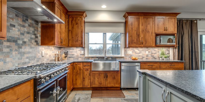
Taking out the peninsula was just the beginning of making the kitchen more functional. The family aimed to clear the countertops, so Paula fit the microwave into the cabinets. The range, which the family already owned, now takes center stage as a standout piece in the kitchen, no longer hidden by the peninsula.
A new apron-front farmhouse sink adds a modern touch to the traditional style. It's versatile, allowing you to place a cutting board or draining rack on top. With its stainless steel apron, it stands out against the wood cabinets.
Beyond creating more space, improvements to the working area between the sink and range include a lazy susan cabinet in the corner, a vertical cabinet beside the range for cutting boards and cookie sheets, and a deep cabinet on the left side of the range for pots and pans. These upgrades make cooking more efficient and enjoyable for the family.
The Result
With the peninsula and wall removed, the kitchen has become a spacious and inviting area for the family to gather in comfortably for any occasion or just the day to day. The new design enhances functionality in a larger space, making it a welcoming hub for everything and everyone.